Welcome to this month’s Blogorail Orange Loop. Today we are sharing some of our favorite architectural details at the Disney Parks.
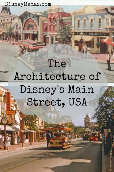
“For those of us who remember the carefree time it recreates, Main Street will bring back happy memories. For younger visitors, it is an adventure in turning back the calendar to the days of grandfather’s youth.” ~ Walt Disney
Often quoted as being based on the main street area of Walt’s boyhood home of Marceline, Missouri, this is hardly the case. Like much of Disney history, the facts and the fables are vastly different from the facts, and cast members, books and television programs like to recount a highly idealized vision of Disneyland’s beginnings. In the case of Main Street, USA the concept was always to create an “Anywhere, USA” main street area that would welcome guests to the park and make them feel immediately at home in an idealized, turn-of-the-20th-century American small town.
Though the designs for Main Street, USA at Disneyland and Walt Disney World are clearly indicative of the same era, each one has its own personality. And for quite a specific reason.
Disneyland’s Main Street, USA was in part designed by Harper Goff, a native of Fort Collins, Colorado. In talks with Walt about what he saw in Main Street he envisioned his hometown, right down to the design of city hall and the red brick fire station. Fort Collins was, in the turn of the century, a prosperous, bustling small town, while still a bit rustic. Goff showed Walt numerous photos of the main street area of his home town, and Walt loved them. The were reminiscent of the “ideal American town” and would translate perfectly to Disneyland. Quaint, and the perfect lead-up to the castle situated just past the end of the street.
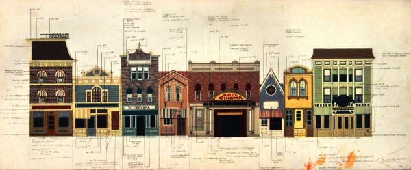
The architecture of Disneyland’s Main Street features gingerbread roof lines, Art Deco features, signs outlined in lights, and varied roof heights. There are nods to the late 19th century, and buildings that call to mind the imagery of spaghetti western films. The various shops and eateries are painted in different colors, reflecting their individual personalities and interior style. These individual building designs work together to create a sense of visual harmony as the guests walk down the street. The street would feature an ice cream parlor, shops, restaurants, a bank and more. Essentially, anything you would expect to find on a turn-of-the-century main street. And Walt was not as concerned with selling Disneyland memorabilia as he was recreating this idealized environment. Original Main Street, USA tenants included a piano store, a bandstand, a Bank of America location, a shooting gallery, a tobacco shop, a lingerie shop and much more. Eventually these gave way to the souvenir shops we have now, though remnants of the Penny Arcade, Magic Shop and more still exist, even if much of their space has been taken over by pins, books, and candy.
Walt Disney World, on the other hand, was designed by film production designer John de Cuir. In 1969 de Cuir won the Academy Award for Best Art Directon-Set Decoration for Hello Dolly! and it is that design that set the scene for Walt Disney World’s Main Street. The street, though similar in function to it’s Disneyland counterpart, reflects a more affluent, Eastern culture. His version of Main Street is more opulent with more symmetrical roof lines, and the storefronts appear more connected to one another. It is also much grander in scale at almost twice the length of Disneyland’s Main Street, USA. Architectural elements from throughout the United States can be seen in the various building structures, and the overall color scheme of the area is more uniform. Whites and creams make up the foundation of the buildings with jeweled reds, greens and blues acting as accent colors in the trim and fabrics. Interior color choices are used to enhance and separate the different locations, and are especially important in areas where one shop gives way to another. In this way the interior color choice and fixture designs are imperative to establishing an individual identity for the particular shop location.
For all their differences, however, there are just as many similarities between the Disneyland and Walt Disney World versions of Main Street, USA. Many of these can be found in the colors and textures of the designs. These design elements work together to create a specific mood for Main Street, USA, and aid in grounding the guest to a specific time and place.
Overall, the color choices are bright and welcoming, and call upon a popular color choices of early 20th century America. Colors are brightened up just as much as necessary to assist in telling the architectural story. Textures and patterns are vitally important to the soft goods, iron work, and gingerbread details of the two Main Street locations. Soft lace textures are used in locations selling women’s apparel and accessories, while deeply oiled woods may be seen in shops selling men’s ware. Children’s shops utilize stripes and plush details, and eateries feature cool marbles and iron seating. These specific textures further aid in telling the story of each distinct location.
Rounding out the architectural story of Disney’s Main Street, USA locations are the props and fixtures. Every prop, every lighting fixture, each display element was painstakingly selected so as to further the architectural story of the area. The element may serve no purpose in the actual park but is there to further cement the identity of the street with guests. No one is hitching their horses to the hitching posts on Main Street, USA, but their existence only helps tell a story that is important to the overall design of both Disneyland and Walt Disney World’s Magic Kingdom.
check out the other great posts from the Blogorail!
Here is the map of our Magical Blogorail Orange | Dealing with Problems at Disney Loop:
- 1st Stop – My Dreams of Disney | Spaceship Earth
- 2nd Stop – Disney Mamas | Main Street, USA
- 3rd Stop – Heidi’s Head | Tree of Life
- 4th Stop – Capturing Magical Memories | Hollywood Studios – Tower of Terror






I adore Main Street USA. So far, I’ve only been to the Walt Disney World version, but I live reading about the similarities and differences and Walt’s original vision for this land.
Great post, Lin! Thanks for sharing with us. I’ll never forget my first memory of Walt Disney World’s Magic Kingdom! Here’s what I remember most:
“As you pass under the railroad tracks, somehow, Walt Disney has magically taken you out of the here and now, and transported you back to a different time, a different place, where small town Americana is alive and well; where Main Street isn’t just the name of a street, but it is a place to hang out with your friends, where you can eat, shop, and even catch a movie. As you gaze at all of the incredible buildings, you are taken aback at how long Main Street, U.S.A. is. It seems like it goes on forever! But you peer at the end of the street, and what do you see? This magical castle waiting for you, beckoning you to take a look at it, daring you to even go inside of it! You have heard about that castle, how it is Cinderella Castle, and belongs to her. You have read about how you can walk all the way through the castle, and come out in Fantasyland. You have even heard that you can even have a meal at Cinderella’s Royal Table — but that memory is for another trip.”
Thanks!
Mike
I love the Main Street vehicles the best! They really fill out the atmosphere.
I agree. And at Disneyland they add so much to that bustle of a real Main Street. They are amazing.
Everything about Main Street is magical. The music just transports me there. IT’s truly amazing.
Pingback: Disney Architecture